Logo Design – Valaris Construction
Program: Illustration
Concept of Logo for a Construction company in San Francisco, CA. Unsure of the company’s status, but the logo is still cool to showcase.
Program: Illustration
Concept of Logo for a Construction company in San Francisco, CA. Unsure of the company’s status, but the logo is still cool to showcase.
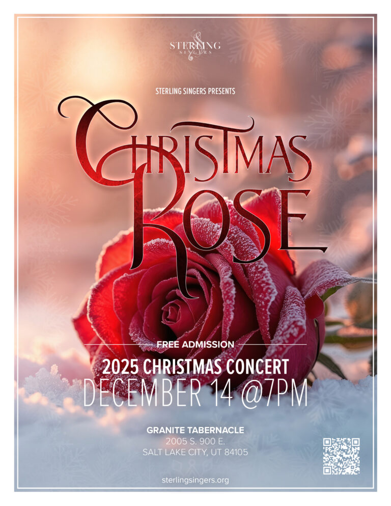
Client: Sterling Singers Choir
Programs: Photoshop
The Sterling Singers choir’s 2025 Christmas concert poster. Name of the concert is Christmas Rose.
The client reached out to me to design their poster for their upcoming concert for the 2025 season. This is a regular occurrence this time of year for the client’s to perform their most popular concert.
This year’s concert name is Christmas Rose. Up to this point, I did not know what a Christmas rose was. So, I reached out to the client for clarification and their response was simple: a red rose with snow. That has the potential for a great visual.
First, I needed an image of a rose with some sort of incorporation with snow. The two options I focused on were a flower sticking up out of the snow or the flower laying on the snow.
The first thought I had was a custom photoshoot. I looked up the local weather to see if snow was on the horizon within the timeframe that I had. No luck, the snow hadn’t touched down yet nor was it on any weather radar for the near future…so stock photo it was. Stock photo’s aren’t bad, just a bit trickier to find what you are looking for. After some scouring, I found the image: a vibrant red rose slightly frosted laying on the snow with a warm sun.
Now that I had the image, I needed time to let the image “speak” to me to find the font that would work. My go-to Futura, no, not this time. Proxima nova? no. To match the rose, the font needed to be elegant. While clicking through the countless fonts on my machine, I started to reflect on the rose laying in snow felt majestic…almost fantasy like. They it hit me, it looked like one of my favorite Disney animated movies “Beauty and the Beast.” Found a font that fit the esthetic I was going for and started the design.
I brought the photo into photoshop and made the adjustments needed to fit it into the sizes for the project. Added the title and applied some texture to give it a “icy” feel. I used Proxima Nova for the body copy as it has multiple weights to help with hierarchy as well as creating the needed bold to handle the white text as dark text didn’t have the contrast enough to stand out. Added the QR Code so people can get more information. The last thing I added was the logo at the top.
This was a fun project to work on. The colors were the highlight for me, that being the different shades of red.