Client:
AdvancedMD
Tool(s):
Photoshop, Illustrator
Role:
Creative Director
The Brief
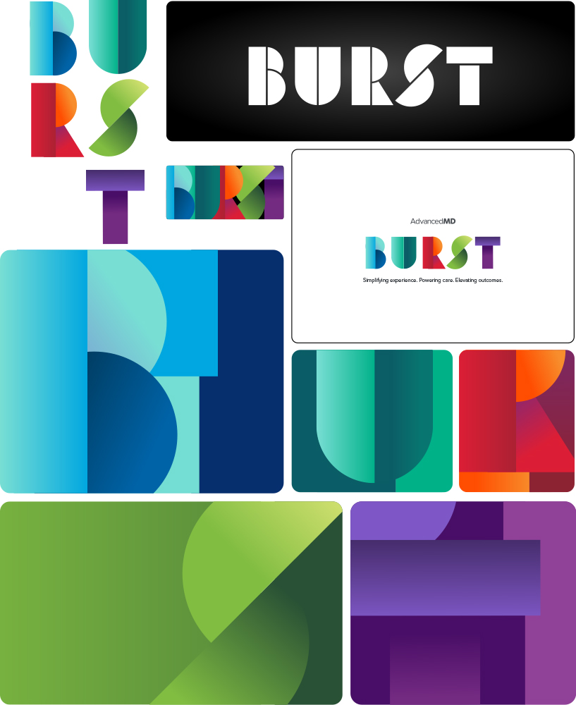
AdvancedMD executives came to me directly to brand BURST, the company’s incoming 2026 internal initiative replacing the retiring FIT program. The name is an acronym: Be Intentional, Urgency with purpose, Respect for others, Strive for greatness, Together with clients. The only creative direction I was given was that it had to be unique, cool, and had to feature the word BURST.
The Challenge
Branding an internal initiative is a different animal than branding a product or company. There’s no existing market to reference, no competitor landscape to push against, and the audience is internal, which means it has to earn genuine enthusiasm rather than polite approval. Starting with zero creative direction made it wide open and, honestly, a little intimidating.
The Approach
I started by researching current design trends to find a direction worth presenting. Three concepts emerged: a bar graph approach playing on the idea of burst-as-growth, an overlapping layered text treatment that leaned purely aesthetic, and a retro art deco style. I mocked up all three and brought them to the executive team. The art deco direction won the room.
From there it was a refinement problem. The U letterform had a curve that felt off, so I straightened it. Removing a circle element left the letter incomplete, so I split the U into two shapes to match the visual logic of the rest of the letters. Once the silhouette was locked, the colors felt flat in mockup. Researching solutions led me to gradient treatments.
The Result
The executive team’s reaction went beyond what even I was expecting. A project that started as an open-ended creative challenge with no brief produced a brand identity that felt cohesive, energetic, and completely intentional. BURST launched as the visual anchor for the AdvancedMD 2026 company initiative.