Client:

AdvancedMD

Tool(s):

Photoshop, Illustrator

Role:

Creative Director

The Brief
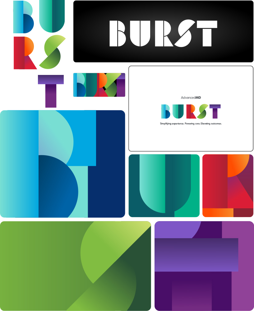
AdvancedMD executives came to me directly to brand BURST, the company’s incoming 2026 internal initiative replacing the retiring FIT program. The name is an acronym: Be Intentional, Urgency with purpose, Respect for others, Strive for greatness, Together with clients. The only creative direction I was given was that it had to be unique, cool, and had to feature the word BURST.

The Challenge
Branding an internal initiative is a different animal than branding a product or company. There’s no existing market to reference, no competitor landscape to push against, and the audience is internal, which means it has to earn genuine enthusiasm rather than polite approval. Starting with zero creative direction made it wide open and, honestly, a little intimidating.

The Approach
I started by researching current design trends to find a direction worth presenting. Three concepts emerged: a bar graph approach playing on the idea of burst-as-growth, an overlapping layered text treatment that leaned purely aesthetic, and a retro art deco style. I mocked up all three and brought them to the executive team. The art deco direction won the room.

From there it was a refinement problem. The U letterform had a curve that felt off, so I straightened it. Removing a circle element left the letter incomplete, so I split the U into two shapes to match the visual logic of the rest of the letters. Once the silhouette was locked, the colors felt flat in mockup. Researching solutions led me to gradient treatments.

The Result
The executive team’s reaction went beyond what even I was expecting. A project that started as an open-ended creative challenge with no brief produced a brand identity that felt cohesive, energetic, and completely intentional. BURST launched as the visual anchor for the AdvancedMD 2026 company initiative.
AdvancedMD Corporate Website

The Challenge

When I joined AdvancedMD, the company was about to hit it’s growth spurt within the healthcare SaaS space. The marketing team had just launch the 2014 rendition of the website using Expression Engine. The website was called, by us later, as the “bowling ally” site because of the decision to use wood paneling…still to this day I don’t know why they went this direction.

All the fonts when over the wood paneling had an offset outline to make it look like it was indented in the wood, there was different wood grains based on what page we were on, and the biggest issue is that it didn’t feel like a software SaaS website. Lead generation tanked down to near nothing.

About a year after this launch, and after a complete rebranding of the company, I was given the responsibility to art direct, rebuild, and relaunch the entire website…and I need to do it in three months.

My Approach

I brought myself and the two other web designers in marketing into a “war room” to separate ourselves from the distractions of the day-to-day. We worked on selecting a CMS that can grow with us, figured out how the lead gen was to work, and the overall “feels” of what AdvancedMD could be in the future.

Selection of the CMS
The first thing we needed to do before moving onto design was picking a content management system, or CMS. We needed to do this because Expression Engine wasn’t working for what we needed. It was bloated, slow, easily broke (sometimes multiple times in a day), hard to find developers, and doing any custom work was out of the question (hence the breaking). We looked into Sitecore, Drupal, Joomla, and other various options, but in the end we decided to go with the ever popular WordPress. WordPress gave us everything we needed to bring the website into what we wanted to do with the website, which was customization and control.

Lead generation
The next step we needed to do focus on was the lead generation issue. We were using Adobe Marketo Engage for our email campaigns already, so we decided to tap into that asset. We actually tested this on the bowling ally site for a bit so see how we can utilize it the best. It offered embedding or adding a script to utilize the built on page forms. After much testing, embedding the forms from Marketo directly onto the website was the direction to go.

Jumping forward a bit, for this iteration of the website (the 2016 version) we put the form on every page…we did not test this approach as this was a request from the higher ups. We year or so later we tested this and found that having a form on every page actually decreased lead generation, so we replaced it with a button. Every lead went through the pricing page, resource (learning) center, or live demo pages.

The design
Design was a different matter. Gone was the wood paneling, dated icons, the dated technology and devices, and in its place was a clean, minimalistic white. White became the theme. Why white? Because it offered the ability to “splash” color into the mix. The AdvancedMD logo at this point was a multiple color hummingbird with about four different colors and various tints and shades of those colors. So, to emphasis this branding, I decided to make these colors the accents.

In the end, we brought in high def screenshots of AdvancedMD, had a custom photoshoot for the “everyday doctor” feel, introduced an actual SEO strategy bringing the main pages to number one spots with Google, and moved the corporate website into a stable environment where we had the freedom to do what we needed to do.

Since the 2016 launch, the website has remained relevant in messaging and stable even with the introduction of Ai. A few things have happened along the way. It has survived two brand refreshes due to AdvancedMD being aquired by different parent companies. Recently it went through a complete backend rebuild from WP bakery to Bricks Builder (which was completed in one month) while keeping

The Result

Today, as of this writing, the website is a strong powerhouse full of information for every aspect of AdvancedMD. It is also a main source of lead generation for the AdvancedMD sales team, and not just any leads…ones that convert to clients.