
Graphic Design

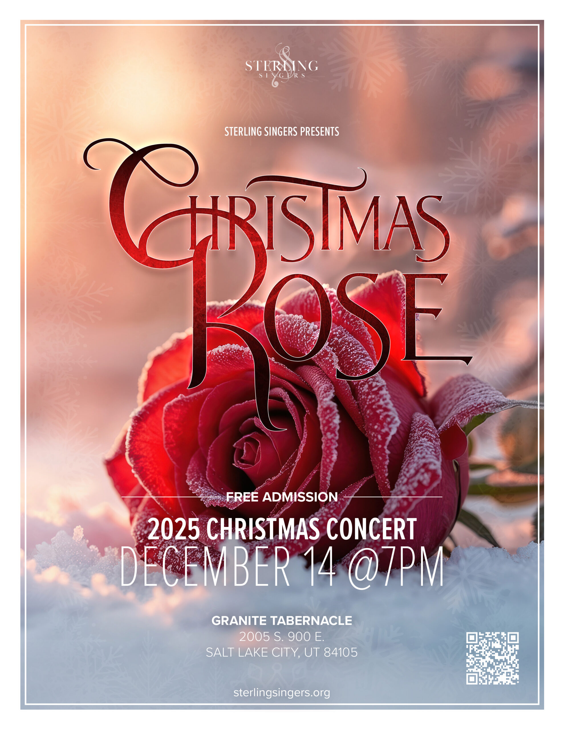
Christmas Rose Concert Poster

Client:

Sterling Singers

Tool(s):

Photoshop

Role:

Designer, Freelance
The Brief
Sterling Singers, a recurring client, needed a concert poster for their 2025 Christmas season performance. The concert title was Christmas Rose. My first question was an honest one: what exactly is a Christmas rose? The client’s answer was simple and immediately visual: a red rose with snow.

The Challenge
A strong concept lives or dies on the hero image. My first instinct was a custom photoshoot, but a quick check of the local forecast ruled that out. No snow on the ground, none coming within the project window. That meant finding a stock photo specific enough to serve a very particular mood, not just any rose, and not just any snow.

The Approach
I narrowed the image search to two compositions: a rose rising up through snow or a rose resting on it. Once I found the right shot, a vibrant red rose lightly frosted, lying on snow with warm light behind it, the direction became clear. The image had a majestic, almost fairytale quality to it. That association pointed me straight toward the typography.

My usual go-to fonts didn’t fit. Futura was too geometric, Proxima Nova too modern. The rose lying in snow felt closer to something from Beauty and the Beast than a standard holiday event. That instinct led me to an elegant, fantasy-adjacent display font that matched the mood. For body copy I came back to Proxima Nova, using its weight range to handle hierarchy and keep white text legible against the photo.

Texture was added to the title treatment to reinforce the icy feel, and a QR code was included so concert-goers could find more information easily.

The Result
The final poster leaned into the romance of the image rather than the typical holiday red-and-green formula. The color story, multiple shades of red against the cool whites of the snow, gave it a warmth that stood out. Sterling Singers had a poster that felt as considered as the concert name itself.
Still & Forever Photography

This website is fictitious. AI used to mimic a client, including requests as if a client asked for it.

The Concept

A self-initiated spec project exploring modern AI-driven client workflows, brand identity, and custom web design for a boutique wedding photographer based in Utah.

Key Highlights

  • Innovative AI Client Workflow.
    Prompt-engineered Claude to act as a realistic, feedback-heavy client persona (“Kiera”) to introduce real-world constraints, scope changes, and design feedback throughout the build.
  • Symbolic Brand Identity.
    Researched and designed a custom mark combining sacred geometric symbolism (heavens/earth) with elegant typography and a warm, regal color palette suited for high-end wedding demographics.
  • Rapid Design Execution.
    Designed a complete, high-fidelity responsive layout in Figma within hours by leveraging AI-driven content generation and modular design systems built for WordPress/Bricks Builder.
  • Design Resilience & Adaptability.
    Turn negative project outcomes (a lost pitch) into a repeatable testing environment for new design tools and creative methodologies.

The Challenge

After a potential client decided to go with someone else, I had this design concept sketched out for a wedding photographer website, including notes, and I decided to not let that go to waste. I opened Figma and Illustrator and got started.

The Client Rejection
Having a client decide to go with someone else is nothing new to a designer. Would I have liked the extra cash? Sure, but what do you do, right? You move along and start the next project. Building resilience to the rejection is still an ongoing pursuit that I, and my other fellow designers, are trying to do each time. I have learned, instead of sitting in the corner rocking back and forth, you learn from it. With this particular situation, I decided to move along with the website anyway.

In Need of a Client
There was one problem…I didn’t have a client. Sure, I could design for myself, but that wasn’t what I was looking for with this project. I needed a solution. I needed a “client.” Why did I want an actual, although fake, client? I wanted challenges that only a client can make. Curve balls that would make me question the design.

Need of a Brand
Another thing I lacked was a brand. Usually with a client, they give me their logo, colors…name of the company or business. I thought of a few items. A note from the interview was that the client was a Utah based photographer who focused on weddings and receptions.

My Approach

The Client & Audience
While writing the interview down, while it was fresh in my mind, I had a thought come to me. What about having AI mimic a client…could it do that effectively? I turned to Claude, the one I’ve been training now for well over a year to be a designer. I told it to “be the client” and gave the rundown and interview in the prompt. It immediately turned on the client mentality and even asked how difficult I wanted it to be. It named itself Kiera, a freelance photographer from Utah.

The audience for this project was to be centered around weddings and the bride (20-30 years old), which fits the demographics in Utah. I had Claude make all the text (better than Lorem Ipsum, in my opinion).

Naming and Brand
With my client now working for me, I needed to make a name for the business. After a lot of prompts, I settled on Still & Forever Photography. Perfect for a Utah based photographer who deals with only weddings. I had Claude come up with a set of color palettes, as if a client would, and then had a “design interview” where the logo was discussed. In true fashion, the AI wanted a camera in the logo with a sans-serif font. It just didn’t look right, so I scrapped it and did my own research. I know that the AI is the client in this scenario, but it’s still my design in the end, and I really only wanted it to throw curve balls on the website more than the brand itself.

I tried many things, but when I was playing with some camera icon ideas, I remembered something from my past. A square with a circle in it had a special religious meaning. In Hebrew traditions, the heavens (circle) and the earth (square) together stand for heaven on earth. That fits perfectly for a wedding photographer in Utah. The symbol was created and placed above the logotype, which was switched to a serif font to help it feel elegant.

I decided on brown and cream as the base colors, with an ivory off-white for the white. This decision was for a few reasons. I was trying to create a warm and inviting aesthetic, while also having a royal yet elegant mindset. I didn’t want a black website for this, nor did I want a blue or just white site. It needed to stand out.

The Website
Figma was the obvious choice for this project. Even though I wasn’t going to program this into an actual website, I still wanted it to be as if I was going to, so the layout was designed with WordPress (my preferred CMS) in mind, using the Bricks Builder structure. I started to block it out, section by section. Once I had the navigation done, which I just kept generic, I moved to the hero. Forgot to mention, I planned on at least 8-10 photos…unsplash.com for the win!

The AI Client
Throughout the design process, I would prompt Claude to trigger a client response to make a change to the scope of the project. One of the changes was that they wanted a photo of “themself” on the home page. So I had to go back and add the section, with the corresponding text. After each section, I would take a screenshot and post it in the prompt for feedback. My favorite response was “make the logo bigger”…it clearly understood the assignment. So, yeah, it gave feedback on what was good, what they wanted to change, and also remove just because it decided to change its mind. I pushed back just as I would with a client on dumb ideas, and so on. I also had it pause being the client a few times to ask quick questions about why something wasn’t working the way it was supposed to in Figma. It was a great experiment, and something I may use in the future for another “fake” project.

The Result

After completing this website design, I came to understand what AI can do to help others, including myself, grow in their design skills. I was also able to get a website designed within only a couple of hours, because I wasn’t coming up with the content, which is usually my hurdle. Regardless, I now have a photography template at my disposal and an AI system that’s getting better at how I design, so it can give me better feedback on things in the future.